On October 25, we hosted From The Vault: Out With the Old, In With the New.
As the technology that we use improves and advances, so to do the things we can create with that technology. Maps in the modern day look drastically different than those used several hundred years ago, and are now able to tell us a multitude of different things than they could previously. But what do these changes actually look like? How has the process of digitizing cartography evolved how we communicate our place in the world? And how do maps from hundreds of years ago compare to the maps we use to navigate our world today? Look through the maps and captions from Out With the Old, In With the New to further explore these questions.
The World
Ptolemy, The world (1482)
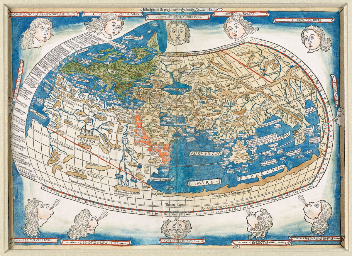
“The World” is a map from the late 1400s that served as part of a 2nd century printed Atlas based on geographical knowledge of the Roman Empire entitled “Cosmographia”. This map of the world in particular was originally created by Greek-Egyptian geographer Claudius Ptolemy, then lost to time and only later recreated using coordinates left in surviving texts. Often thought of as the father of cartography, Ptolemy’s maps were integral to how location and place were thought about throughout medieval Europe, and had long lasting impacts on how we think of geography today. By building on some of the first known attempts at projection in mapping (the method by which cartographers mathematically represent the Earth’s spherical surface on a flat plane), Ptolemy’s world map was considered mostly accurate and used for years before any changes were made. Because the “New World” had yet to be discovered, the center of this map highlights the meeting point between Asia, Europe, and Africa.
United States. Central Intelligence Agency, Physical map of the world, April 2001 (2001)

This “Physical Map of the World” from 2001 used by the CIA shows a modern view of the world in the 21st century and features light topography to demonstrate the different elevations and terrains of each continent. Similarly to Ptolemy’s world map, this map also employs projection, though it uses a more modern method of cylindrical projection called “Robinson projection.” Robinson projection was developed by Arthur H. Robinson in 1963 using computer simulation to create a more visually pleasing and overall more accurate looking world map. Instead of keeping the proportions as accurate as possible for most of the map and greatly distorting the poles like a usual Mercator projection, the Robinson projection causes slight distortions across the entirety of the image. While less useful for navigation than other projection techniques, the Robinson projection is commonly used on world maps to visually demonstrate general world proportions.
The Atlantic Ocean
Ptolemy, Oceani occidetalis seu terre nove tabula (1525)

This map of the Atlantic Ocean and New World from the mid 1520s is one of the first representations of the West Indies and South America on a map in recorded history, and surprisingly accurate given the recency of the land’s discovery. This map comes about 30 years after Columbus’ first voyage to the new world and features the Southeastern corner of what is now the United States including Florida. The Gulf of Mexico and the shape of Central America remain largely amorphous on this map, and the scale of South America and Spain in comparison to Africa is extremely overinflated. The humanoid illustrations on this map demonstrate colonists' initial crude impressions of the native peoples whose longstanding homes were part of what Europeans referred to as the “New World”. Unfortunately, these opinions would persist through the coming centuries and heavily shaped stereotypes and opinions around peoples of the New World, specifically South America, for centuries to come.
Netherlands. Koninklijke Marine. Dienst der Hydrografie, North Atlantic Ocean, West Indies (1993)
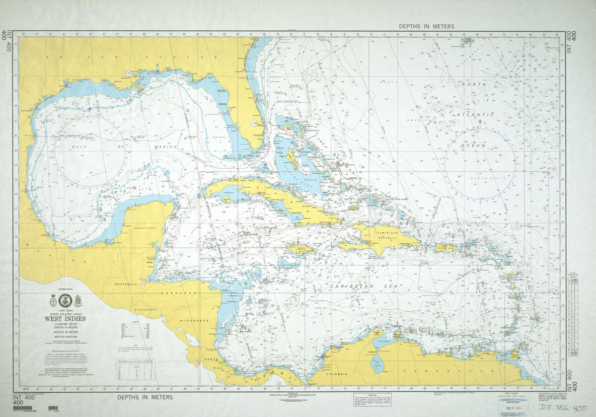
This 1993 map of the West Indies demonstrates a significantly more accurate scale than the map from the 1520s, and really spotlights the Gulf of Mexico, the Caribbean Sea, and the Northern part of the Atlantic Ocean. Upon first glance, this map may take some adjusting to as it is primarily mapping the ocean as opposed to landmasses. The yellow represents the Southeastern US and West Indies as well as Central and South America, and anything in blue or white represents different oceanic features. This specific map highlights the different depths of the ocean off the coasts of North and South America, and really shows off the proper scale of Cuba and the other Caribbean islands as compared to the map from the 1500s. As technology became more prevalent in the map making process, accuracy in size and scale became more assured.
Asia
Ptolemy, Indie interioris civitates decima Asia tabula continet India int. Gangem (1482)

This map of Asia from 1482 is another Ptolemic map recreated from the writings of early Greco-Egyptian geographer Claudius Ptolemy. The map focuses primarily on India and faintly its surrounding area. What many older maps are choosing to show us versus what they omit frequently provides more information about the time period than strictly looking at the geography of the map itself. In this case, the map is putting so much focus into India because that is the main Asian country that the Roman Empire was trading with in the 1st century. While there was minimal established trade contact between the Roman Empire and other Asian countries to trade delicacies like silk and glassware, there was no direct trade route established to these places. India on the other hand had many direct trading routes with Europe during this time, so the area West of the Ganges river as seen here was mapped extensively.
United States. Central Intelligence Agency, Asia (2004)
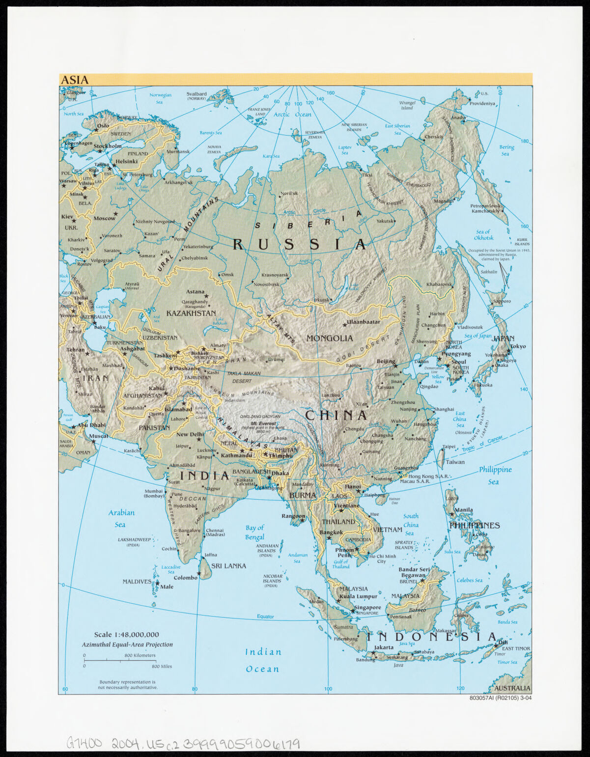
This 2004 map of Asia created by the CIA shows off the geography and topography of both South and East Asia, and provides a comprehensive look at the different natural features of the land (mountains, rivers, deserts, etc.) as well as listing the locations of each country and their capital cities. Looking at this modernized computer generated map of India, one can see how dramatically different the scale of different areas of the country was depicted in Ptolemy’s time vs now. Despite both of these maps being fairly bare bones, a shift in tone from more decorative mapping to more practical mapping can be clearly seen between these two especially. This map features a miniature scale in the bottom left hand corner of the map meant to demonstrate the actual sizes of the landmarks portrayed, as opposed to a more decorative scale bordering the entirety of the map as seen on the 1482 model. Even features of maps so small and minute as a scale can affect the tone of the map and what we take away from it!
Mexico
Abraham Ortelius, Hispaniae novae sivae magnae, recens et vera desciptio : 1579 (1608)
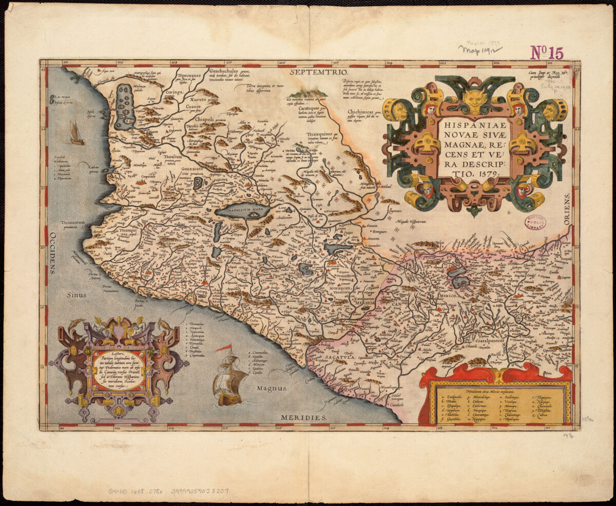
This 1608 map of Mexico was created by Flemish cartographer Abraham Ortelius during a period of time in which Spain had control over both Belgium and Mexico. Because of this, this map is extremely decorative, and focuses on both the vastness of the land that Spain possessed in the area now known as Mexico as well as focusing primarily on Spanish landmarks and settlements in the country. Frequently, the royalty of powerful countries would have their royal geographers create maps of land they possessed not strictly to demonstrate the geography of the land but to overinflate the area they supposedly controlled to make them appear more powerful. In this case, Ortelius was drawing the land to such a grand scale to make it look larger and more impressive than it actually was so Spain could flex its imperial power. Ortelius also entirely ignored the Americas in this map and left Mexico to appear as an entirely separate entity from North America, primarily because Spain had little to no control over that land.
Applied Geographics, Inc., Mexico - US border infrastructure (2000-2010)

In contrast to the older map of Mexico, this newer 2010s map of the same area is spotlighting the connections between the United States and Mexico using details about the border and the infrastructure of the area. This map was made with the purpose of not just showing off the geography of Mexico or being a navigational tool, but instead to highlight the connections between Mexico and the United States and how those two entities interact with one another. Because this map is specifically focusing on the US-Mexico border and the different travel routes into one country and out of the other, the different locations featured on the map are exceptionally detailed and make up most of what is shown. Since the United States played such a large part in this map, both in terms of creating it and also being a focal point of its subject matter, the Southern United States is featured very obviously in white and takes up nearly half of the map, which is not the case in the Ortelius map of 1608.
Boston
William Price, A new plan of ye great town of Boston in New England in America, with the many additionall buildings & new streets to the year 1743 (1743)
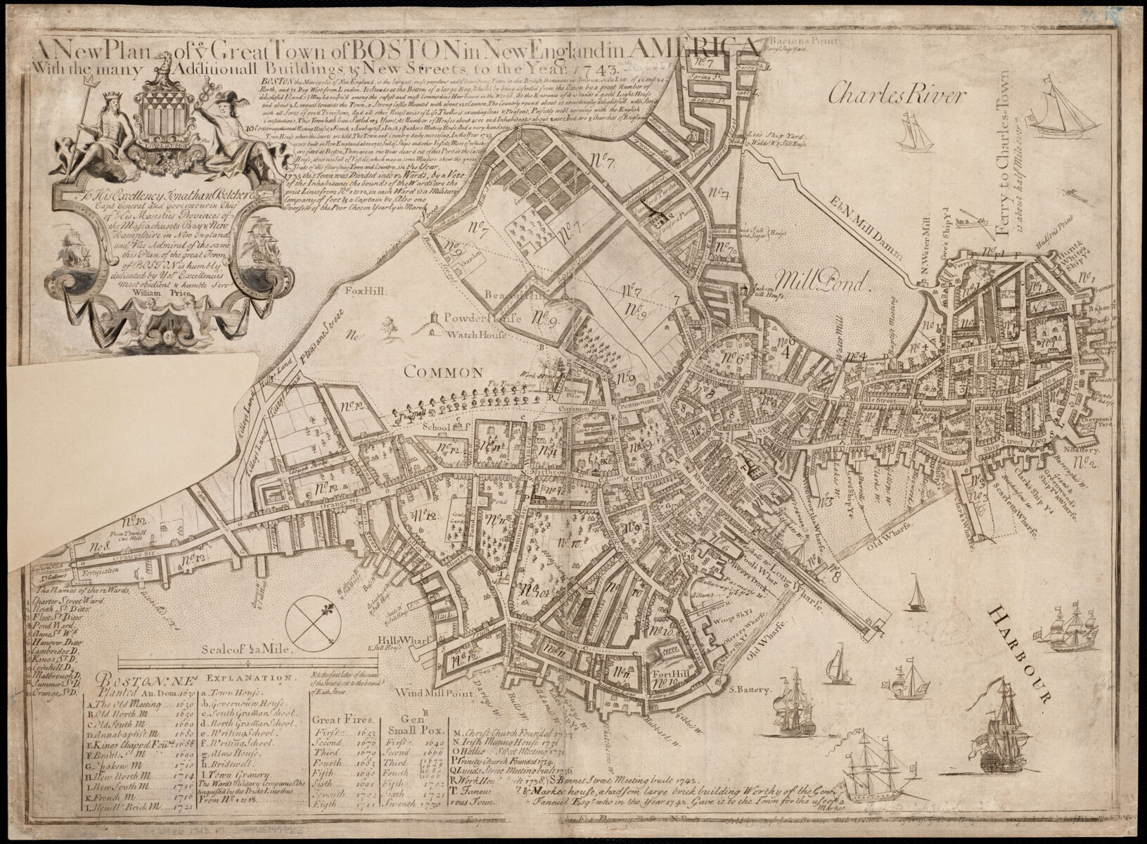
This 1743 map of Boston shows off the pre-revolution state of the city of Boston and its plans for expansion and development under the British Empire. This “New Plan” for Boston was created by William Price to divide the city into more quadrants and prepare it for more people to be able to live in the metropolis. Because this map is being created with the intent for more people to move here and to make the city look appealing, the buildings and landmarks of Boston are more in focus on this map than things like towns, roads, or other purely practical navigational matters. Looking closely at this map you can see the things that the British valued and what made up the cultural identity of Boston at the time, with the many groupings of houses that make up cozy neighborhoods, the large parks and areas of greenspace and trees, and primarily the wharfs and ports of the city with countless ships drifting in and out. This map is particularly thought provoking towards conceptualizing the space we occupy right now as the area of Back Bay that we are currently standing in was not even a thought in 1743!
Chan Krieger & Associates, Boston Over Time : filling in the land 1630 - present (2008)
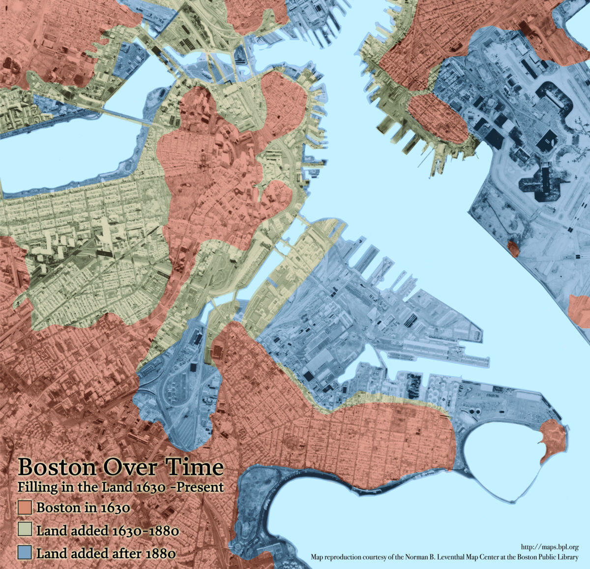
This newer map of Boston shows the city at 3 different points in history; 1630 in red, 1880 in green, and 2009 in blue, and highlights specifically how the land of Boston has evolved over time. For many of the maps in this display, the changes seen over time in the maps primarily focus on how people interacted with the land they occupied and what their intent behind creating a map of a certain space was. Contrarily, this map of Boston is a clear marker of how the physical land of the city has changed over time. Looking between this map and the one from 1743, the differences are stark. There is no trace or concept of what is currently the Seaport area on the 1743 map, nor is there any reference to Back Bay or many other parts of Boston that are integral to its identity today.
While we may think solely about people impacting a place and imparting our own identity onto the city we live in, how much of that identity is shaped by the place itself? How much does Boston impart its own identity onto the people that occupy it?
Our articles are always free
You’ll never hit a paywall or be asked to subscribe to read our free articles. No matter who you are, our articles are free to read—in class, at home, on the train, or wherever you like. In fact, you can even reuse them under a Creative Commons CC BY-ND 2.0 license.