On February 21, we hosted From The Vault: Holding the Narrative — Understanding the Social and Real World Implications of Maps.
Sometimes, what’s not included can be just as informative as what’s being represented.
Maps and atlases hold the power of expressing (or not expressing) certain perspectives, or narratives, about a location that can become widely shared and considered absolute truth. In the case of the continent of Africa, and the consequences of the colonialism and imperialism it was subject to, these narratives have the potential to be unreliable, incomplete, or outright racist.
While looking through the maps and captions of Holding the Narrative: Understanding the Social and Real World Implications of Maps, consider what narratives you know about the continent and invite yourself to question what’s being shown in each map—from its physical features down to the historical context behind their creation.
Guillaume de L’Isle, Carte de la Barbarie le la Nigritie et de la Guinée (1707)

This map shows the parts of northwestern Africa that makes up parts of modern day Mali, Burkina Faso, Niger, Nigeria, the Central African Republic and Chad form the green region entitled “Nigritie” in the mapped subsection of northwestern Africa. “Nigritie” was a derogatory term coined by Europeans to describe this specific African region before the time of widespread European colonization. It had multiple variations across Europe, including “Negroland”, which was the term used amongst English speakers in the seventeenth and eighteenth centuries.
In fact, many of the modern names of African countries came from either the language spoken by European traders (Greek, Latin, Arabic, or Portuguese most often), European mispronunciations of place names given by the indigenous people of the region, or geographical features. Names hold the power to make places real, which is why many Africans choose to either refer to themselves by ethnic group or, more generally, as pan-African.
Johnston, Harry H. & J. G. Bartholomew, Colonizability of Africa (1899)
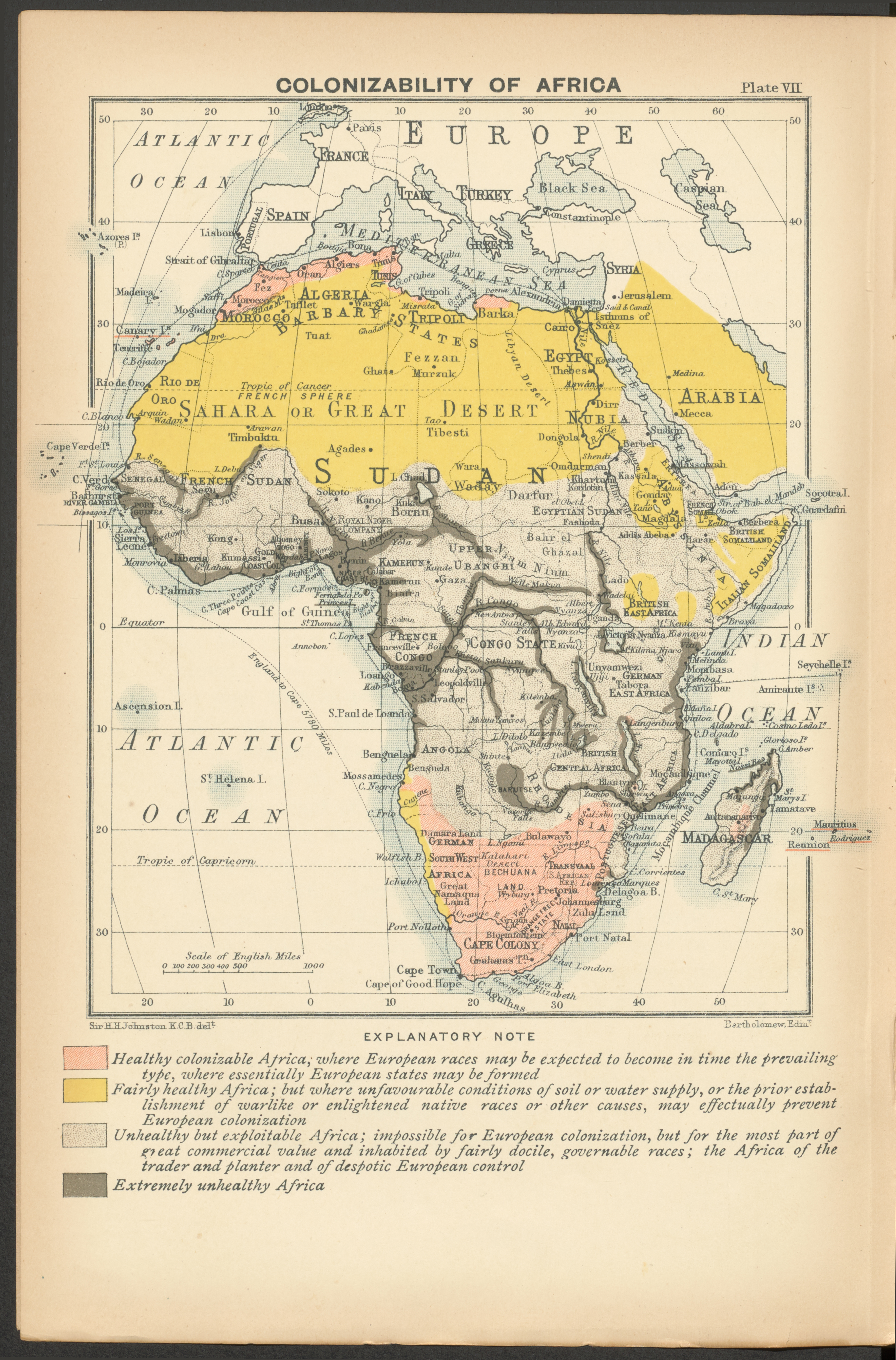
This map is a part of a 300-page work by Sir Harry H. Johnston entitled “A History of the Colonization of Africa by Alien Races” (1899) that categorizes parts of Africa using the code word “health” to describe what type of colonialism would work best in a given area. Racist language throughout Johnston’s explanatory note portrays Africa as a place seemingly “owed” to Britain, even to the extent of forced labor and expected obedience.
Settler colonialism is alluded to by the “Healthy colonizable Africa” and “Fairly healthy Africa” categories, with the “Unhealthy but exploitable Africa” category describing extractive colonialism, where the indigenous population was to be kidnapped and enslaved.
As a longtime British colonial administrator in the late 19th century, Johnston would have been seen as an authority figure on knowledge about the African continent for those in the United Kingdom, thus he held power in shaping the way people thought of the continent. If you’re interested in learning more about Johnston and this map in relation to establishing power in empires, check out our past exhibition Bending Lines on our website under “past exhibitions”.
United States. Central Intelligence Agency, Africa, ethnolinguistic groups (1996)

The fifteen major ethnolinguistic groups shown in this map are each represented by a colored region that encompasses the tribes or ethnic groups within it. The spread of ethnolinguistic groups across Africa are not confined by the boundaries of modern countries, and can overlap, as is the case of northwestern Nigeria. In the same vein, many countries have as many as 4 ethnolinguistic groups within their borders. So, if the borders of countries do not exist to encompass ethnolinguistic groups, then why do they exist the way that they do?
European powers were in danger of infighting in the late 1800s due to the speed at which each country was expanding their imperialist agenda to Africa. The Berlin Conference of 1884-1885 met to solve this very issue by drawing borders and parceling off each of the newly formed 50 European colonies to each other. Since then, the number of countries and borders have changed due to newly independent sovereignties being established spanning from the 1920s to the 2010s.
Ernst Georg Ravenstein, The graphic map of European possessions in Africa (1884)

At the time of this map’s conception, the European countries listed on the map had claimed 10% of the African continent and its islands. Notably, their only claims at this point had been land along the coastline, islands, or rivers, as all were easily accessible by sea compared to the terrain more in-land on the continent. Land south of the Sahara desert was relatively unknown to European voyagers. The threat of malaria and other tropical diseases that Europeans had no defenses for also made it difficult for them to invade civilizations that lay further in-land.
William R. Shepherd, The partition of Africa (1911)

In the twenty-seven years after the Berlin Conference of 1884-1885, colonization of the African continent developed rapidly past the initial establishment of colonial claims due to the final conference negotiations, which had allowed European countries to pick apart the continent as fast as they could. By 1914, a mere three years after this map’s creation, 90% of the African continent was under some measure of European control—either for extractive purposes or establishing settler colonies.
At the same time, World War I was beginning, and many of these colonies, as extensions of the occupying European countries, sent their indigenous inhabitants to fight on behalf of these colonist empires.
Allen Carroll, Africa’s Natural Realms (2001)

This map divides Africa’s environment by the plants and animals that distinctly characterizes each ecoregion, which are large areas of land made up of many similar ecosystems, rather than grouping together distinctly different ecoregions and defining them as a biome.
With each zone designated to a unique color, National Geographic shows the extensive number of ecoregions present on the African continent—contrary to the belief in popular media that Africa is simply a desert, rainforest, or savanna. In addition, the specifying of different ecosystems helps portray how vastly different deserts can look depending on its location on the continent.
However, it’s key to note that a map is a bit of an oddity, only recently drawn up in 2001 for environmental preservation purposes. If there wasn’t urgency from National Geographic, it may not have been made available for the public.
Mathew Carey, Africa according to the best authorities 1800)

Although highly detailed, especially around the coast of West Africa, is it key to note that the names of many kingdoms and colonies are either located far away from its real world counterpart (”Zala” being located around eastern Libya in the map when the only real world counterpart is in Ethiopia) or does not exist in modern texts (there is no record of the “Mujak” region). However, the most striking part of this map is its title: Africa: According to the best Authorities. The title alone brings up some questions. Who gets to claim to be the best and truest source about a certain topic? What makes a person a trusted source to you?
Robert D. Wilkinson, Africa, including the Mediterranean [1808–1822]

This topographic map’s most striking features are the numerous mountain ranges covering the continent, however, many of those mountain ranges are not present on any modern satellite images. Like most maps at this time period, this map features the “Mountains of the Moon”, whose snowmelt runoff was thought to be the source of the Nile River. The mountain range, lying horizontally north of the land labeled “Ethiopia”, while fictional, does have slight similarities to the real life Rwenzori Mountains that lie close to Lake Albert, where the White Nile, one of the offshoots of the Nile river empties into. While Africa certainly has mountain ranges on the continent, neither the Mountains of the Moon or the Mountains of Kong (said to be in West Africa near the Niger River’s source) exist.
Our articles are always free
You’ll never hit a paywall or be asked to subscribe to read our free articles. No matter who you are, our articles are free to read—in class, at home, on the train, or wherever you like. In fact, you can even reuse them under a Creative Commons CC BY-ND 2.0 license.