On March 21, we hosted From The Vault | As Little Land As Possible: Maps of the Oceans & Seas.
Though over 70% of the planet’s surface is covered in water…
…few stop to think about how we map this huge segment of the Earth (and how important it is we do so). From detailing the best maritime trade routes to documenting exploratory journeys across the sea, maps of our largest bodies of water can push the boundaries of our understanding of “conventional” map making.
In this From The Vault, take a look at some of our maps featuring as little land as possible and see all that’s left to uncover.
Marie Tharp and Bruce C. Heezen, Physiographic diagram of the western Pacific Ocean (1971)
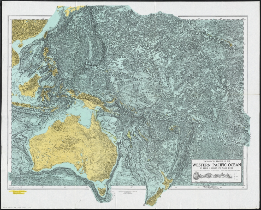
Oceanographic cartographer and geologist Marie Tharp, along with her research partner Bruce Heezen, created the first map of the entire ocean floor. Early editions of ocean floor mapping – as the example reproduced here – feature an informal sketch style, while later final editions were sophisticated physical maps with color and shading, applied to reveal the dramatic mid-ocean canyons highlighting the continental divisions of the globe. Numbers on the map indicate depth of the ocean floor and elevations of individual undersea mountains. Heezen was credited solely for their work for years, and only later on did Tharp gain her rightful place in the cartographic world.
Joseph Frederick Wallet Des Barres, A view of Boston (1779)

This Revolutionary War era landscape scene, published with a collection of nautical charts, depicted Boston Harbor as it would have appeared to approaching ships. While not technically a map or chart, coastal and headland views were also considered navigational aids. Such graphic images assisted ship captains in identifying prominent landmarks as they entered the harbor. Clearly visible on Boston’s late 18th-century skyline are numerous church spires and a flag on Beacon Hill.
Georges-Louis Le Rouge, Remarques sur la navigation de terre-neuve à New-York afin d’eviter les courrants et les bas-fonds au sud de Nantuckett et du Banc de George (1785)

One of the preferred routes that captains and navigators sailing from America to England learned to use was the Gulf Stream, a strong, warm current that flows north along the Atlantic coast and then east toward Europe. Initially charted by Benjamin Franklin in 1768, this discovery helped ships minimize travel time across the ocean, speeding up the transatlantic voyage for travelers, merchants, and goods. Franklin purchased this 1785 chart, a French adaptation of his original findings, when he served in Paris as a diplomat for the United States during the early years of the republic.
Matthew Fontaine Maury, Whale Chart (1851)

The importance of the mid-19th-century American whaling industry, which was dominated by ports in southern New England, especially New Bedford, Massachusetts, is documented by this innovative thematic map. It was prepared by Matthew Fontaine Maury, an American naval officer and oceanographer who served as the Superintendent of the U.S. Navy Depot of Charts and Instruments (later the U.S. Naval Observatory) from 1842 to 1861. Because of his contributions to oceanography including a series of wind and current charts for the world oceans, Maury is often recognized as the father of the science of oceanography.
By centering the map on the Pacific Ocean, however, Maury showed that the primary habitat of whales was the Pacific arena rather than the Atlantic, where the whale resources had been terribly depleted. Interestingly, the sperm whale distribution was heavily concentrated in the central Pacific. This includes the area between Hawaii and the California coast, appearing just to the right of the map’s center, where New England whalers focused their efforts. Seasonal variations were indicated by the letters w (winter), v (spring), s (summer), a (autumn), and all (all months).
H.H. Lloyd, Telegraph chart (1858)

This chart shows the track of the great submarine Atlantic telegraph in the U.S., Canada, Great Britain, Europe, and north Africa, as well as submarine cables, steamship routes, and proposed lines to be added at a later date. Included to accompany the chart are two double column articles of text: one accounts the invention and operation of the magnetic telegraph and the other is a description of the making and laying submarine telegraph cables. The laying of the Atlantic cable was one of the great international undertakings of the nineteenth century and would take the equivalent of billions of dollars, four failed attempts, and another 8 years after this map was published before it was completed.
Jean-Baptiste-Paul Touquet, Chart shewing the tracks across the North Atlantic Ocean of Don Christopher Columbus (1828)

Sailing under the Spanish flag, Christopher Columbus voyaged from Europe across the North Atlantic to the West Indies and made four separate voyages departing from either Spain or Portugal. From his first voyage in 1492-93 to his final voyage in 1502-04, he visited many Caribbean islands, including the larger ones of Hispaniola, Cuba, and Jamaica, as well as the northern coast of South America. This map, published in Paris in 1828, reconstructs the approximate routes of Columbus' trans-Atlantic passages, indicating his location by month and day. The patterns established in these early voyages, which used the predominant ocean currents and the Trade Winds, are the general routes followed by many from the Iberian peninsula and Africa’s West Coast to the Caribbean.
Louis Désiré Léon Brault, Eduard Dumas-Vorzet, and C. Legros, Océan Pacifique (1880)

This sheet is from a set of 4 charts showing direction and strength of winds at different times of year. Each square represents 10 degrees latitude and longitude, and the wind-roses (vector diagrams) show the direction and strength of prevailing winds. The length and color of each point indicate the intensity and likelihood of the winds and the direction it points corresponds with the wind’s positionality. For example, a dark red line with a bit of yellow at the end pointing to the SW would mean this area most often has strong winds (dark red) — or the occasional gentle breeze (yellow) — blowing towards the southwest. The small number inside the circle of each diagram states the number of recordings taken from that location.
Our articles are always free
You’ll never hit a paywall or be asked to subscribe to read our free articles. No matter who you are, our articles are free to read—in class, at home, on the train, or wherever you like. In fact, you can even reuse them under a Creative Commons CC BY-ND 2.0 license.